Najljepši nogometni grbovi

The first emblem of the club is the Lighthouse which is situated on Fenerbahçe cape whilst the first colours of the club are the colours of the daffodils, white and yellow, scattered around the Fenerbahçe peninsula. The emblem and colours were to be changed in 1910 when the badge was redesigned by Topuz Hikmet and the colours were changed as Yellow and Navy...
The Fenerbahçe emblem was designed by Topuz Hikmet who played left wing in 1910 and was made by Tevfik Haccar (Tasci) in London. The emblem consists of five colours. The white section which includes the writing ’Fenerbahçe Spor Kulubu 1907’ represents purity and open heartedness, the red section represents love and attachment to the club and symbolises the Turkish flag. The yellow middle section symbolises admiration and envy, while the navy symbolises nobility. The ’oak acorn’ leaf which rises from the navy and yellow section shows the power of Fenerbahçe. The green colour of the leaf shows the success of Fenerbahçe is imperative.
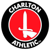
In 1963, club officials held a competition for the design of a new club crest / badge. The winning entry - showing a hand holding a sword - went on to become the first version of the current club crest.
It was also at this time that Charlton Athletic adopted the nickname of 'The Valiants' - linking where the club played (The Valley) to the new club crest.After numerous alterations, including the addition of the surrounding ring and club name, the crest as it is known today was first used for a match against near-neighbours, Millwall FC, on 10 August 1968.
slijedi zanimljivi obrat

On 1st April 2002, Charlton Athletic ran a full-page article in its match-day programme stating that the local council had questioned whether the image of a sword on the club crest was still an appropriate symbol to use for a 'friendly' club. The article went on asking supporters to vote online, stating their choice for a new club crest from three alternatives (shown below). While the first was clearly very similar to the new Fulham FC crest, options two and three were variations on the current crest design, taking into account two of the club's nicknames ('The Addicks' and 'The Robins').
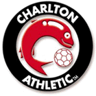
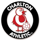
Many fans were seen debating the new crests before, during and after the match against Arsenal and well over 300 voted online for their favourite. Hundreds more supporters rang or emailed the club to complain about the forthcoming change. What they should, of course, have all realised was that it was April Fools' Day!


valjda direktiva iz Ce-Ka... "svi isti font, nemoj da netko talasa!"


nego, jel mi moze netko objasnit koji je tocno Hajdukov grb? Ja sam vidio verzije i s "= =" (ili "II-II", zavisno od kuta gledanja), s "1911" i bez icega, pa mi nije jasno... "1911" bi bilo logicno, no koje je objasnjenje za "= ="? Negdje sam procitao da je bas taj detalj (jednako - jednako) dio Hajdukovog grba
primjeri:
inace, onaj grb sa zvijezdom je nista drugo nego kopija grba praske Sparte u istom razdoblju:
SuperSport HNL
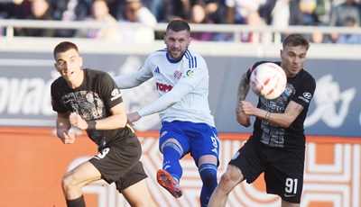
Od igrača više do igrača manje, Rebić i Livaja isključeni na Poljudu
SuperSport HNL
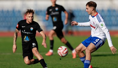
Bizarna utakmica na Poljudu, Hajduk s devetoricom sačuvao pobjedu protiv Vukovara!
Europske lige
Velika pobjeda Zrinjskog usred Banja Luke, Šakota heroj Plemića!
SuperSport HNL
Kronologija: Hajduk izvukao pobjedu protiv Vukovara 1991!
Marko Marušić je napisao/la:
evo da i ja malo pridonesem temi...naletih slucajno

The first emblem of Galatasaray was drawn by Şevki Ege, student number 333. This emblem was an eagle with stretching wings and with a ball in his mouth. "Eagle" was one of the emblems which Galatasaray club considered. However the name "eagle" wasn't accepted and thus the eagle emblem was forgotten. Later on today's GS emblem was born and accepted. Suat Başar explains the way that the GS emblem was born: The year was 1923… That year we were in "cinquieme", that is, the first grade of the lycee. Our friends, Ayetullah Emin and Şinasi
(Şahingiray), were preparing a weekly magazine called "Black Cat" and Ayetullah was writing 90 % of the magazine with his beautiful handwriting. He also decorated the pages and especially the front page of the magazine. Once we saw a "Gayin - Sin"
(G and S letters) drawn simply but elegantly on the front page. Yellow "Sin"
(S) was put into red "Gayin"
(G). This drawing would be the emblem not only of our club, but also of the whole Galatasaray.
SADASNJI:

- Najnovije
- Najčitanije
![[UŽIVO] Jurić protiv bivšeg kluba zabio za vodstvo Rijeke!](/photos/_resized/521/64/0000000000521641_400_230_cut.jpg)
[UŽIVO] Jurić protiv bivšeg kluba zabio za vodstvo Rijeke!
2 sata•SuperSport HNL
Stanišić strijelac i asistent u rutinskoj gostujućoj pobjedi Bayerna
8 min•Njemački nogomet
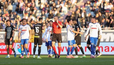
Zdenko Lovrić nakon VAR provjere dao crveni karton Mariju Tadiću
12 min•SuperSport HNL
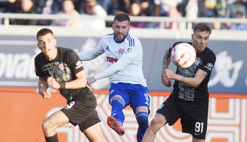
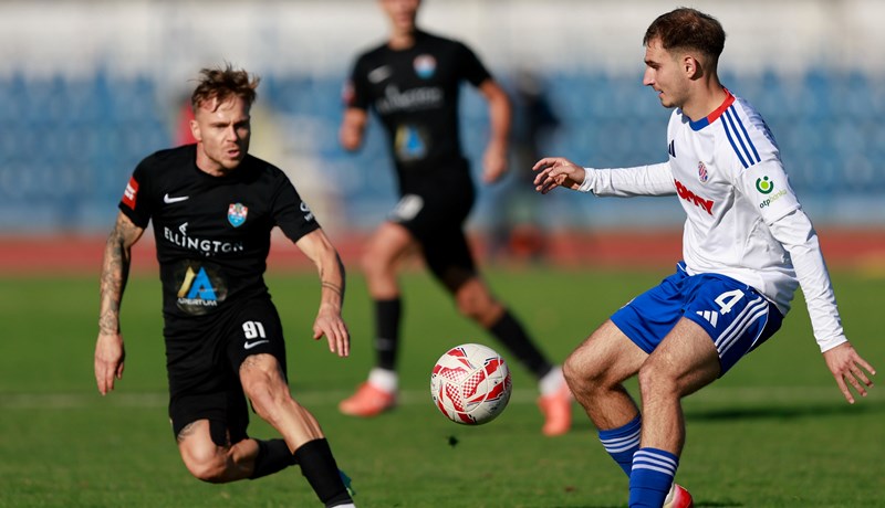
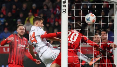
Od igrača više do igrača manje, Rebić i Livaja isključeni na Poljudu
21 min•SuperSport HNL
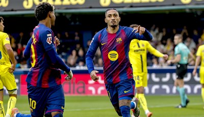
Barca sigurna protiv Villarreala, Raphinha i Yamal potopili Žutu podmornicu
1 sat•Španjolski nogomet
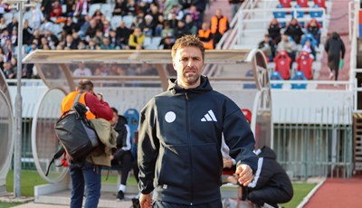
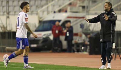
Garcia: 'Livaja zna što mislim o njemu, s Rebićem se znam nekada 'zakačiti', ali to je normalno'
1 sat•SuperSport HNL
Bizarna utakmica na Poljudu, Hajduk s devetoricom sačuvao pobjedu protiv Vukovara!
2 sata•SuperSport HNL
Bizarna utakmica na Poljudu, Hajduk s devetoricom sačuvao pobjedu protiv Vukovara!
2 sata•SuperSport HNL
Kronologija: Hajduk izvukao pobjedu protiv Vukovara 1991!
4 sata•SuperSport HNL
[UŽIVO] Jurić protiv bivšeg kluba zabio za vodstvo Rijeke!
2 sata•SuperSport HNL
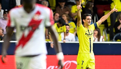
Od naranči do keramike i europske slave: Villarreal - liliputanac koji ruši nogometne careve
9 sati•Španjolski nogomet
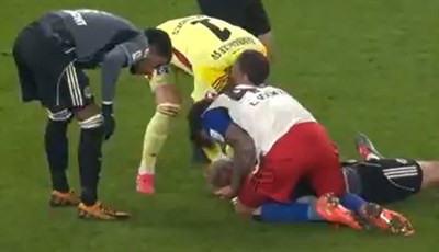
Težak sudar u Bundesligi, Vušković prvi pružio pomoć veznjaku Eintrachta
7 sati•Fanatik

Velika pobjeda Zrinjskog usred Banja Luke, Šakota heroj Plemića!
2 sata•Europske lige
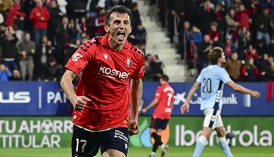
Sjajni Ante Budimir s dva gola predvodio Osasunu do pobjede
23 sata•Španjolski nogomet
Rijeka proslavila prolaz u nokaut fazu Konferencijske lige, u prvenstvu još ima jedan zadatak
4 sata•SuperSport HNL